Elements
This page describes every available element style and its configuration keys.
Keys shown in bold are required. All others are optional.
Common keys shared by all (or most) elements are described in Configuration.
Edit box
style: edit
A single-line text input. The variable type (str, int, or float) is inferred from the
variable’s initial value. Numeric inputs are right-aligned and highlighted red on invalid input.
Key |
Type |
Default |
Description |
|---|---|---|---|
position |
dict |
Element placement; see Positioning elements |
|
variable |
str |
Variable name |
|
variable_group |
str |
inherited |
Variable group |
method |
str |
Callback on editing finished |
|
text |
str / dict |
|
Label |
text_position |
str |
|
Label placement: |
tooltip |
str / dict |
|
Tooltip text |
enable |
bool |
|
Whether the field is editable |
Example:
- style: edit
  position: {x: 120, y: 40, width: 100, height: 24}
  variable: grid_resolution
  variable_group: model
  method: update_grid
  text: Resolution (m)
  tooltip: Grid cell size in metres
Spin box
style: spinbox
A numeric input with up/down arrow buttons. Automatically uses an integer spinbox or a floating-point spinbox depending on the type of the linked variable.
Key |
Type |
Default |
Description |
|---|---|---|---|
position |
dict |
Element placement |
|
variable |
str |
Variable name (type determines int vs float spinbox) |
|
variable_group |
str |
inherited |
Variable group |
method |
str |
Callback fired when the user stops changing the value |
|
minimum |
int / float |
|
Minimum allowed value |
maximum |
int / float |
|
Maximum allowed value |
step |
int / float |
|
Step size per arrow click |
decimals |
int |
|
Number of decimal places (float spinbox only) |
suffix |
str |
|
Unit string appended to the displayed value, e.g. |
text |
str / dict |
|
Label |
text_position |
str |
|
Label placement |
tooltip |
str / dict |
|
Tooltip text |
enable |
bool |
|
Whether the spinbox is interactive |
Example:
- style: spinbox
  position: {x: 120, y: 40, width: 120, height: 24}
  variable: grid_resolution
  variable_group: model
  minimum: 10
  maximum: 10000
  step: 10
  suffix: " m"
  text: Resolution
  method: update_grid
Text
style: text
A read-only label that displays the value of a variable as a string. Updated automatically when the variable changes.
Key |
Type |
Default |
Description |
|---|---|---|---|
position |
dict |
Element placement |
|
variable |
str |
Variable whose value is displayed |
|
variable_group |
str |
inherited |
Variable group |
text |
str / dict |
|
Static text (use |
Example:
- style: text
  position: {x: 10, y: 10, width: 300, height: 20}
  variable: status_message
List box
style: listbox
A scrollable list from which the user selects one or more items.
The select and multiselection keys work the same way as for the pop-up menu.
Key |
Type |
Default |
Description |
|---|---|---|---|
position |
dict |
Element placement |
|
variable |
str |
Selected item/index (or list of them when |
|
variable_group |
str |
inherited |
Variable group |
option_string |
list / dict |
Display strings |
|
option_value |
list / dict |
Associated values |
|
select |
str |
|
|
multiselection |
bool |
|
Allow multiple selections |
method |
str |
Callback on selection change |
|
text |
str / dict |
|
Label |
text_position |
str |
|
Label placement |
tooltip |
str / dict |
|
Tooltip |
enable |
bool |
|
Check box
style: checkbox
A toggle that stores True or False in the linked variable.
Key |
Type |
Default |
Description |
|---|---|---|---|
position |
dict |
Element placement |
|
variable |
str |
Boolean variable |
|
variable_group |
str |
inherited |
Variable group |
text |
str / dict |
|
Checkbox label (shown to the right of the checkbox) |
method |
str |
Callback on toggle |
|
tooltip |
str / dict |
|
Tooltip |
enable |
bool |
|
Example:
- style: checkbox
  position: {x: 10, y: 40, width: 150, height: 20}
  variable: show_grid
  text: Show grid
  method: toggle_grid
Slider
style: slider
A horizontal slider for selecting a value in a numeric range.
Key |
Type |
Default |
Description |
|---|---|---|---|
position |
dict |
Element placement |
|
variable |
str |
Variable storing the current value (integer) |
|
variable_group |
str |
inherited |
Variable group |
minimum |
int |
|
Minimum value |
maximum |
int |
|
Maximum value |
method |
str |
Callback fired when the user releases the slider |
|
slide_method |
str |
Callback fired continuously while dragging |
|
text |
str / dict |
|
Label |
enable |
bool |
|
Example:
- style: slider
  position: {x: 200, y: 40, width: 300, height: 24}
  variable: year
  minimum: 2000
  maximum: 2100
  slide_method: update_year_label
  method: reload_data
Date/time edit
style: datetimeedit
A date and time picker widget.
Key |
Type |
Default |
Description |
|---|---|---|---|
position |
dict |
Element placement |
|
variable |
str |
Variable storing the datetime value |
|
variable_group |
str |
inherited |
Variable group |
method |
str |
Callback on value change |
|
text |
str / dict |
|
Label |
text_position |
str |
|
Label placement |
Table view (read-only)
style: tableview
A read-only table populated from a pandas.DataFrame stored in a variable.
Supports row or column selection, sorting by column header click, and single
or multi-selection. The table cannot be edited by the user — use style: table
for an editable table.
Key |
Type |
Default |
Description |
|---|---|---|---|
position |
dict |
Element placement |
|
variable |
str |
Variable storing the selected row index or indices |
|
variable_group |
str |
inherited |
Variable group |
option_value |
dict |
|
|
selection_type |
str |
|
|
selection_direction |
str |
|
|
sortable |
bool |
|
Whether clicking a column header sorts the table |
method |
str |
Callback on row/column selection |
|
text |
str / dict |
|
Label |
text_position |
str |
|
Label placement |
Example:
- style: tableview
  position: {x: 10, y: 10, width: -10, height: 200}
  text: Available scenarios
  text_position: above
  variable: selected_row
  option_value: {variable: scenarios_df}
  selection_type: single
  method: select_scenario
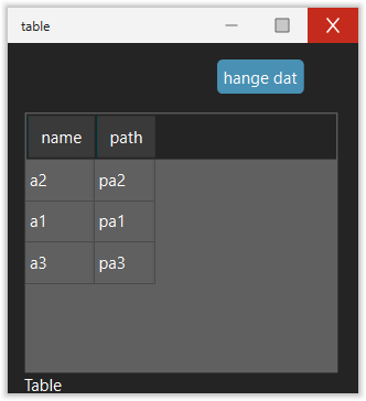
Table (editable)
style: table
An editable table backed by a pandas.DataFrame. Users can double-click
(or press a key) to edit cell values in place. The edited value is parsed back
to the column’s original dtype (int, float, or str). Invalid input is
automatically reverted.
Key |
Type |
Default |
Description |
|---|---|---|---|
position |
dict |
Element placement |
|
option_value |
dict |
|
|
variable_group |
str |
inherited |
Variable group |
editable |
bool |
|
When |
sortable |
bool |
|
Whether clicking a column header sorts the table |
method |
str |
Callback fired after a cell is edited (or a row is selected when not editable) |
|
text |
str / dict |
|
Label displayed below the table |
Example:
- style: table
  position: {x: 10, y: 10, width: -10, height: 150}
  text: Parameters
  option_value: {variable: dataframe}
  editable: true
  method: on_cell_edit
Python setup:
import pandas as pd

df = pd.DataFrame({"name": ["a1", "a2"], "value": [1.0, 2.0]})
app.gui.setvar("mygroup", "dataframe", df)
Web view
style: webpage
Embeds a web browser (PySide6 WebEngine) that displays a URL.
Key |
Type |
Default |
Description |
|---|---|---|---|
position |
dict |
Element placement |
|
url |
str / dict |
|
URL to load (static or from variable) |
Example:
- style: webpage
  url: https://guitares.readthedocs.io/
  position: {x: 10, y: 10, width: -10, height: -10}
Frame (panel)
style: panel
A container that groups child elements. Frames can optionally show a border with a title and can be made collapsible.
Key |
Type |
Default |
Description |
|---|---|---|---|
position |
dict |
Placement of the frame within its parent |
|
title |
str |
Border title (no border shown if omitted) |
|
element |
list |
Child elements (same syntax as the top-level |
|
collapse |
bool |
|
Make the frame collapsible |
collapsed |
bool |
|
Initial collapsed state |
fraction_expanded |
float |
|
Fraction of parent taken when expanded (used with |
fraction_collapsed |
float |
|
Fraction of parent taken when collapsed |
id |
str |
Unique identifier (required for collapsible frames) |
Example:
- style: panel
  title: Model settings
  position: {x: 10, y: 10, width: 300, height: -10}
  element:
  - style: spinbox
    position: {x: 10, y: 10, width: 120, height: 24}
    variable: dx
    text: dx
    suffix: " m"
Tab panel
style: tabpanel
A container with multiple named tabs, each holding its own set of child elements. See Using tab panels for full documentation.
Map
style: map (or style: maplibre / style: mapbox)
An interactive map widget. See The Map Widget for full documentation.